📊 Dashboard
Graphing
Use the query editor to customize the graph displayed on the Metrics Explorer page.
You can specify the time frame in the top right corner of the page. The default is Past 3 Months.
Metrics that are not reported in the last 24 hours do not appear in the query editor. You can manually add these metrics to your graphs by entering the metric name or full query.
Chart Types
There are 5 types of charts
%20(4).png)
You can select them on the UI
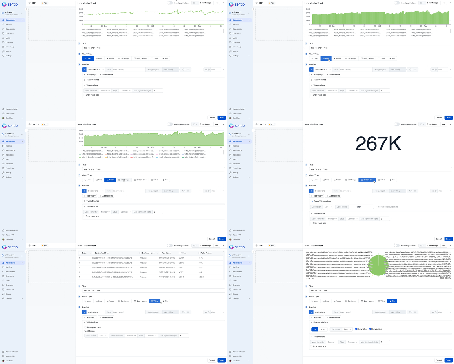
Line, Bars, Areas
These 3 are very similar. The only difference is the visual. They still represent a time series.
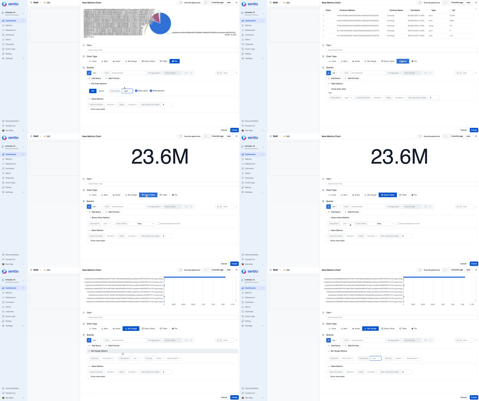
Bar Gauge, Query Value, Table, Pie
These 4 reduce One time series to One single number. Using this option below:
Selecting Time Range
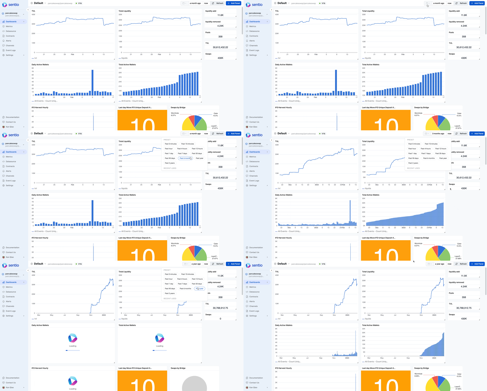
There are generally 3 ways to select time range. One is using Time picker
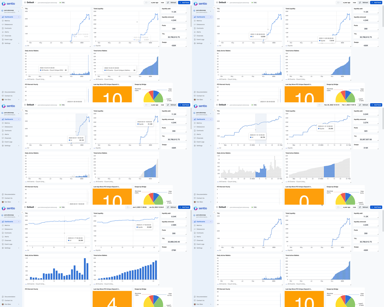
The other approach is to directly select from the graph. You can use standard browser forward/backward controls to adjust the selected range.
Our third and most recently added method gives you the power to adjust the time range interactively, right from the chart view. The selector controls the time interval by which your metric is grouped. Changing this allows you to "zoom in" or "zoom out" on your data to identify different kinds of trends.
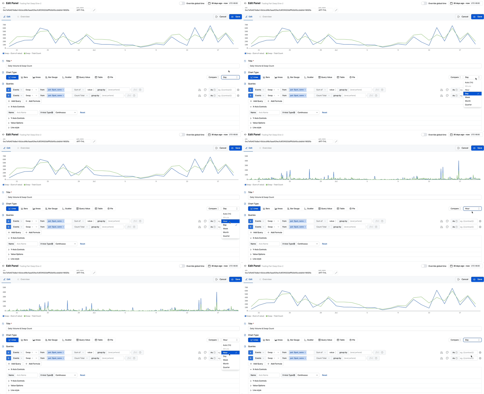
You can select from the following options:
- Hour: The most granular view. Each data point on the chart represents one hour. This is ideal for analyzing intraday patterns or sharp, recent changes.
- Day: The default view. Each data point represents a full day. This is best for monitoring daily trends and standard operational metrics.
- Week: Each data point represents a full calendar week. This helps smooth out daily fluctuations and reveals weekly cycles.
- Month: A high-level view where each data point represents a full calendar month. Perfect for long-term strategic analysis and reporting.
- Quarter: The highest-level view, grouping data by financial quarters. Best for board-level reporting and long-range planning.
Comparing Time Periods
The Compare to... dropdown is a powerful feature for contextual analysis. It overlays a secondary, historical line on your chart, allowing you to instantly compare current performance against a previous period.
When you select an option, the chart will display the current data alongside the data from the corresponding previous time frame.
For example:
- If you are viewing data for the last 7 days and select Compare to previous week, the chart will show two lines: one for the last 7 days, and another for the 7 days prior to that.
- If you are viewing data for the current month and select Compare to previous month, the chart will show this month's performance against last month's performance up to the same day.
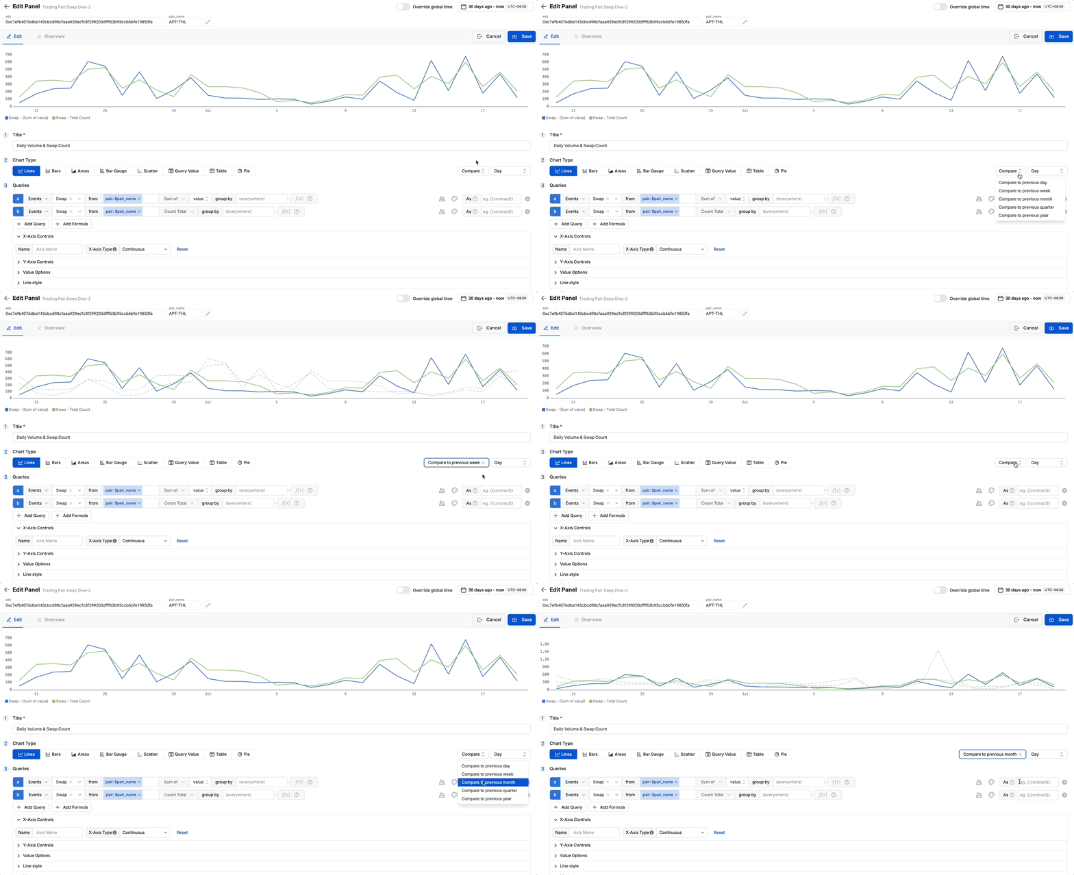
This feature is invaluable for answering questions like "Are we performing better this week than last week?" or "Is this month's growth on track compared to last month?".
Scope
Define a filtering scope with the from text box by selecting or searching for tag values. For example, you can use the from text box to filter metric values from a specific address, contract or any other custom labels defined in the processor.
.png)
Build Metrics Dashboard
To better visualize and compute metrics, you can build dashboards using the metrics collected.
This is following the metrics submitted by monitor-coinbase-cbeth-mint-burn-via-events
Here is one example where we have a dashboard showing the Mint Activity - 24 Hours Aggregation:
.gif)
Here we take a metric and apply a rollup function to perform 24 hours sum aggregation. For more about the formula and functions, refer to aggregation-functions-and-formulas
Build Event Analytics Dashboard
Following monitor-pancake-swap-ifo-deposit, we could build a dashboard to show Daily Active Users.
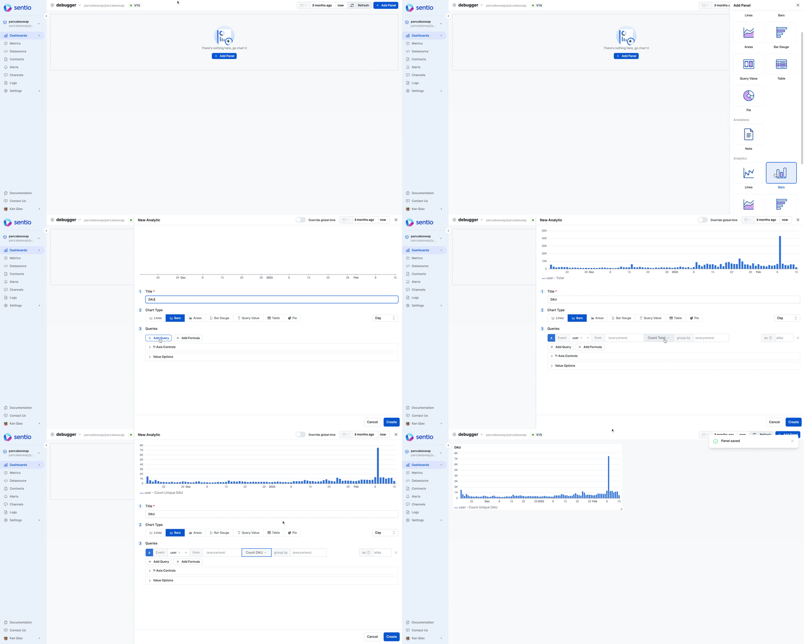
This requires that events were submitted with #distinct-id.
Build a Dynamic Dashboard
Once you've mastered the basics of creating and arranging panels, the next step is to transform your static dashboards into powerful, interactive tools. Instead of duplicating dashboards for every new contract or user segment, you can build one flexible dashboard that adapts to your analytical needs.
This is all made possible by Variables.
Ready to level up? Our comprehensive guide will walk you through everything you need to know, from basic setup to advanced techniques for creating truly dynamic and user-friendly dashboards.
Updated 3 months ago